In 1936 the BBC became the world's first broadcaster of a regular high-definition television service. In the beginning, the gaps between the programmes would be filled with tuning signals (also known as test cards) or on-screen announcers.
The first attempt at proper branding came in 1953 when Abram Games was commissioned to design the BBC's on-screen identity. He was famous at the time for designing the logo for The Festival of Britain of 1951.
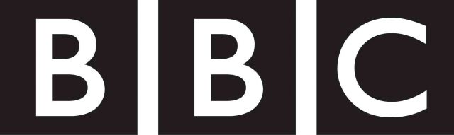
1962 saw the first example of the BBC lettering in boxes. Initially the letters were slanted with the boxes upright. Later, this would evolve into the familiar BBC corporate logo, with slanted boxes.
In September 1955, BBC Television had a new, commercial rival when ITV launched.
In 1988, the BBC decided that if it was to compete effectively with its commercial rivals, it would need a strong corporate image to make its products stand out in the market place. A new corporate logo was commissioned to be used on its stationery, videos, books and even paper cups.
The new image, designed by Michael Peters, looks back to the old, traditional BBC logo, but is updated by underlining the slanted boxes. An animated ident was produced with a jingle, which was used for BBC promotional films, BBC videos and exported programmes.
The three colours are those of the phosphors on a colour television. There were also national variants. BBC Scotland had its underlines all in blue; BBC Northern Ireland used three green underlines; BBC Wales used all red.
After only six years, the BBC decided another re-launch was necessary. This time not only would Lambie-Nairn tackle the two BBC channels, but also the BBC's corporate logo.
The old one, the Beeb said, was no longer up to the job. Apparently, it just didn't "work on screen". To make it work, the coloured lines underneath the three lozenges were banished, the sides were straightened from their 17.5-degree slant, and the typeface was changed to Gill Sans. Oddly, Lambie-Nairn reportedly claimed the 1988 logo hadn't been modern enough. Yet after its make-over, the new, simpler logo is very reminiscent of the BBC's first from 1932. And the new typeface, based on that used on the London Underground and other London Transport, was invented in the 1920s.
When the change was first rumoured back in August 1997, Gerald Kaufman, the chairman of the National Heritage Select Committee said, "It seems to me there could be a more useful way of spending licence-payers' money. This confirms that while the BBC is funded by the tax-payer and theoretically accountable, in fact it does exactly what it wants to."